Modular Shopping Model
Company
Comcast
My Role
Lead Designer
Duration
1.5 Years
Background
Background
Comcast is one of the nations’ largest telecommunications companies providing cable, internet, telephone, wireless, and home security services to residential customers in 40 states through Xfinity. However, Comcast’s customer satisfaction often ranks among the worst in the industry.
This dissatisfaction is partly due to Comcast’s selling model, which has always relied on only allowing customers to get service in bundles. Through this model, customers can gain short-term savings but often end up with added services they don't want or need. These bundles often come with promotional discounts that expired after a certain timeframe, but the price increase after the discount code expiration isn’t clear to customers at the purchase time.
The Problem
Comcast prospective customers don't want to buy service bundles. Instead, they want to have the flexibility and control to buy only the products and services they want. Additionally, customers have expressed frustration at the lack of pricing, contract, and discounting transparency. They are often surprised when their prices go up after the promotional period ends for their plan.
The Goals
Simplify the shopping experience and let customers fully customize their plan while also providing transparency around pricing and promotional discounts. Our team also wanted to prove that a customer-centric shopping model would improve customer trust and satisfaction while also increasing sales.
To create a shopping experience that satisfies customers’ needs for flexibility and control as well as pricing transparency while shopping for services on xfinity.com. Our team wanted to also prove that this new shopping model and experience would improve customer trust and satisfaction without negatively impacting sales.
To create a shopping experience that satisfies customers’ needs for flexibility and control as well as pricing transparency while shopping for services on xfinity.com. Our team wanted to also prove that this new shopping model and experience would improve customer trust and satisfaction without negatively impacting sales.
Flexibility
Give customers ultimate control to pick their services and products
Transparency
Show pricing upfront, including taxes, fees, promos and discounts.
Show pricing upfront, including taxes, fees, promos and discounts.
Show pricing upfront, including taxes, fees, promos and discounts.
Show pricing upfront, including taxes, fees, promos and discounts.
Show pricing upfront, including taxes, fees, promos and discounts.
Helpfulness
Helpfulness
Facilitate learning about services that fit into customers’ lifestyle.
Two Possible User Flows
We wanted to explore a traditional e-commerce cart model where prospective customers could add individual services to a cart and build their own package while also customizing their plan by making equipment and add-ons selection. While brainstorming, we decided to explore two user flows for customizations: a linear model and a hub and spoke model.
The Linear Model
The Linear Model
This approach allows customers to make their service selections upfront and then walks them through a single customization flow for all of their selected services.
Benefits
- Smaller price jumps
- Service selection on one screen
- Works well with pre-configured service bundles
Drawbacks
Drawbacks
- Lots of scrolling on mobile
- Poor management of all-in price
- Upsells are less contextual

The Hub and Spoke Model
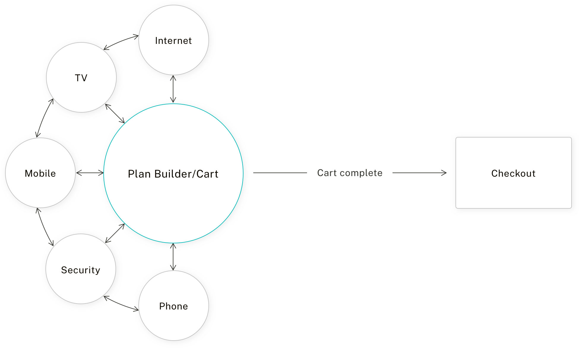
In this flow, the hub serves as a central location where customers can select a single service and continue through a customization flow (the spoke) for that service in a focused and organized way. After going through this flow, customers land back on the hub to access additional services and add to their plan. Once customers finish building their plan, they can move on to the checkout flow.
Benefits
- Better all-in-price management
- Upsells are contextual to customers' decisions
- Customization flow is more focused and organized
- Centralized location for plan builder and cart
- Better all-in-price management
- Upsells are contextual to customer decisions
- Customization flow is more focused and organized
- Centralized location for plan builder and cart
Drawbacks
- Larger price jumps as customers go through several customization flows for each service added.
- Pre-configured bundles become a bit trickier to communicate
Three ways to build and customize
Flexibility was one of the main pillars of the modular concept. We identified three different shopping entry points when we analyzed how customers think about navigating the site and purchasing products and services. Both linear and hub & spoke models could service each of these entry points.
Pre-configured Bundles with Savings
Pre-configured Bundles
Pre-configured Bundles
Customers looking for recommendations and discounted pricing can start with a pre-bundled package that they can later customize.
Service or Product Selection in Learn
Service Selection in Learn
Service Selection in Learn
Tier Selection in Learn
Tier Selection in Learn
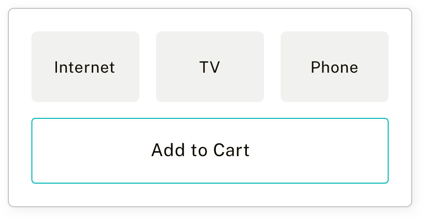
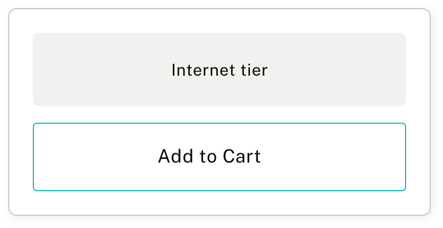
Customers who like to learn and explore the site before making a purchase can add services or products to a cart while in a learning context.
Build Plan From Scratch
Build from Scratch
Build from Scratch
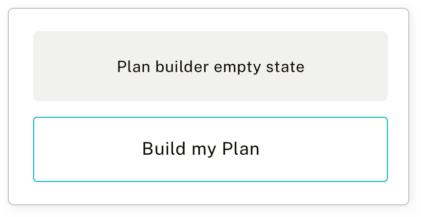
Customers who come into the site knowing exactly what they want to purchase can build their plan from scratch using the plan builder.
Sketch Explorations
Design Exploration
Design Exploration
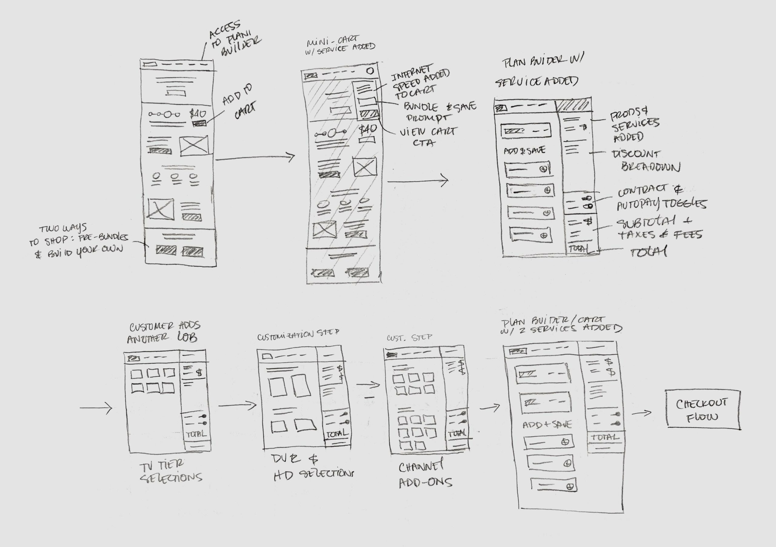
Based on the hub and spoke model, I roughly sketched out a simple user flow. In this flow, the user adds a tier of service to their cart, accesses the plan builder/cart, and goes through a customization flow. This gave us enough interactions to test out the concept at a high level.
Design Exploration
Design Exploration
Design Exploration
Design Exploration
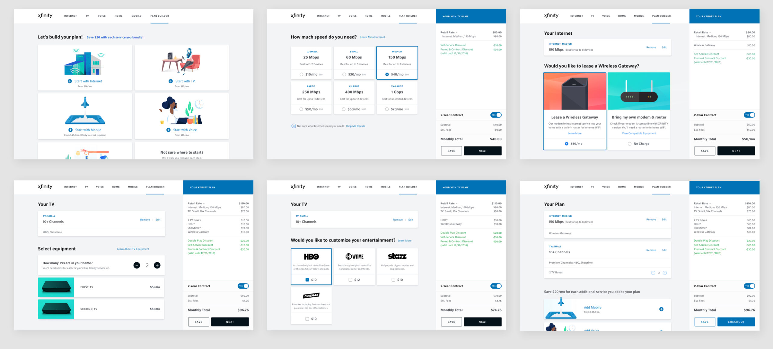
The team explored a few design options based on the rough sketches. We also created Keynote and Principle prototypes to show interaction and motion, and we began to conduct usability tests with the high-fidelity mockups. Once we had confidence in the design concept, we began pitching it to stakeholders and Brian Roberts, CEO of Comcast.
User Testing and Insights
We hypothesized that participants would find the hub and spoke shopping model to be an intuitive way to build a service package that best fits their needs and is also easy to customize. Through 15 remote unmoderated tests, we aimed to gain insights on the following:
Learning Curve
Understand level of effort it would take customers to learn the new shopping model
Ideal Flow
Determine the best flow that would allow customers to have flexibility and control
Pricing Perception
Understand customers’ level of comprehension of pricing, promotions and discounts in the cart
The experience positively resonated with the participants; the majority of them thought it was clear, easy to use, and gave them confidence in knowing what exactly they were buying and paying for.
"They lay packages out clearly. You can see what you’re saving, you can see all that you’re getting.”
"This has been one of the clearest experiences I have ever had.”
Offer Construct Simplification
To provide a flexible shopping experience for our customers, we needed to do a significant amount of work to simplify our offer constructs. Traditionally, Comcast’s offer model has relied on a particular and complex system of service bundles, discounting, promotions, and contract lengths that worked against the proposed simplified modular shopping model.
In order to provide a flexible shopping experience for our customers we needed to do a significant amount of work to simplify our offer constructs. Comcast’s existing offer model relies on a very specific and complex system of service bundles, discounting, promotions and contract lengths that worked against the proposed simplified modular shopping model.
Our Product Manager and I were involved in discussions with the Pricing & Packaging team to assess opportunities and formulate a plan that would promote company-wide policy change and offer construct simplification. Some of the things we were able to achieve for the Central Division include:
Our Product Manager and I were involved in discussions with the Pricing & Packaging team to assess opportunities and formulate a plan that would promote company-wide policy change and offer construct simplification. Some of the things we were able to achieve for the Central Division include:
- A simplified tier structure of for internet and TV
- By reducing the number of choices, we solved for choice overload, which was a persistent problem in the old shopping model.
- By reducing the number of choices, we solved for choice overload, which was a persistent problem in the old shopping model.
- Systematization of discounting and contract agreements to promote a more transparent experience.
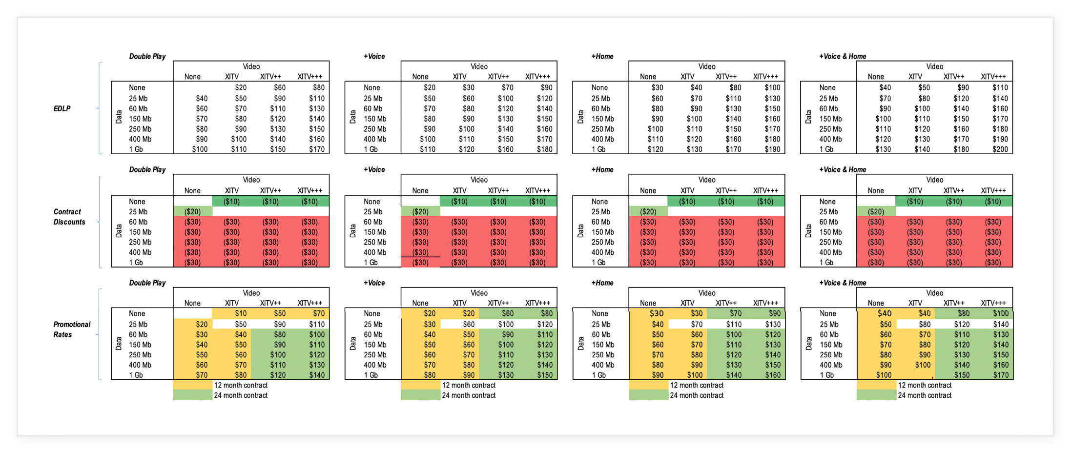
The Pricing & Packaging team provided me with a matrix of all of the service tiers with everyday pricing as well as contract lengths and discounts to start creating a more realistic prototype of the concept. I used the matrix to map out possible combinations of services and identified any potential issues we needed to solve for on the front-end.
Scoping Down for The Trial Experience
While there was excitement at the leadership level about the initial concept, we decided that instead of betting everything on a major launch that would require a longer timeline and additional resources, we would take a phased approach delivering the "hub" portion of the concept as plan builder page to start.
Hypothesis
Allowing customers to build their own plan using the modular framework will drive an increase in new connect revenue-generating units (RGUs).
Audience
• Prospective customers
• Geo-localized to Indianapolis
• All primary shop pages
• Mobile and desktop devices
Scope
We determined that we would test the plan builder page only and not include any of the customization steps as part of the experience.
KPIs
• Sales Conversion Rate
• Checkout Start Rate
• Revenue Per Visit
• Engagement
Updated Design
I simplified the experience to be a one-page plan builder where customers could see all of their available options at once and select the tiers of each service they were interested in. All of the equipment and channel customizations remained a part of the checkout flow.
Price Transparency
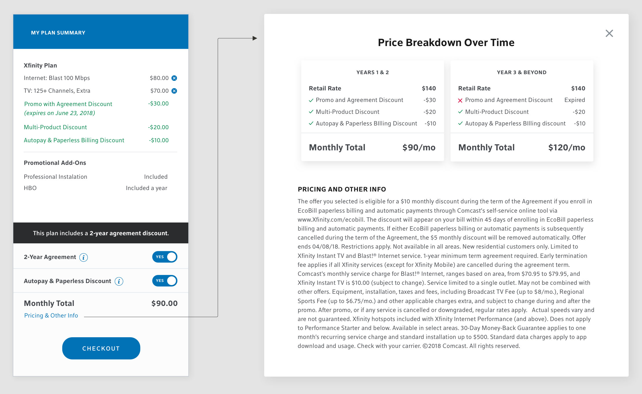
I wanted to provide as much pricing transparency as possible for customers, so I provided clear information around discounting in the cart with obvious indicators for contract length and promotion expiration dates. I also added the option to toggle contracts and optional discounts on and off to clearly see the price difference while retaining control of what they purchased.
In addition to in-cart information, I revamped the traditional legal modal to provide a clear visual breakdown of plan pricing over time. This visual solves a long-standing customer problem of not knowing how or when their monthly price will increase. It also gives them the confidence they need to make a purchasing decision and proceed to checkout.
In addition to in-cart information, I revamped the traditional legal modal to provide a clear visual breakdown of plan pricing overtime. This visual solves for a long-standing problem of customers not knowing how or when their monthly price will increase. It also gives them the confidence they need to make a purchasing decision and proceed to checkout.
In addition to in-cart information, I revamped the traditional legal modal to provide a clear visual breakdown of plan pricing overtime. This visual solves for a long-standing problem of customers not knowing how or when their monthly price will increase. It also gives them the confidence they need to make a purchasing decision and proceed to checkout.
In addition to in-cart information, I revamped the traditional legal modal to provide a clear visual breakdown of plan pricing overtime. This visual solves for a long-standing problem of customers not knowing how or when their monthly price will increase. It also gives them the confidence they need to make a purchasing decision and proceed to checkout.
In addition to in-cart information, I revamped the traditional legal modal to provide a clear visual breakdown of plan pricing overtime. This visual solves for a long-standing problem of customers not knowing how or when their monthly price will increase. It also gives them the confidence they need to make a purchasing decision and proceed to checkout.
Trial Results and Expansion
The Indianapolis modular trial was successful in not only improving the customer experience but also improving sales numbers. Because of the trial's success, the experience was expanded to heartland Indiana by mid-January of 2019 and the entire Central Division by the end of Q1 of 2019.
+7%
RGUs
+3%
Sales Conversion Rate
+20%
Checkout Start Rate
The Future of Xfinity.com
The Future of Xfinity.com
The Future of Xfinity.com
After the modular trial's success, the West and North East divisions have shown interest in adopting the same shopping model. The UX team is currently partnering with Product, Pricing & Packaging, Research, and Engineering teams to leverage some of this work as a foundation for a vision of what the future of xfinity.com should look like. I am actively working on a Join Customer Journey work track to define a strategy for this vision and start creating a roadmap for 2021.