Xfinity Digital Transformation
Company
Comcast
My Role
Senior Designer
Duration
2 Years
The Problem
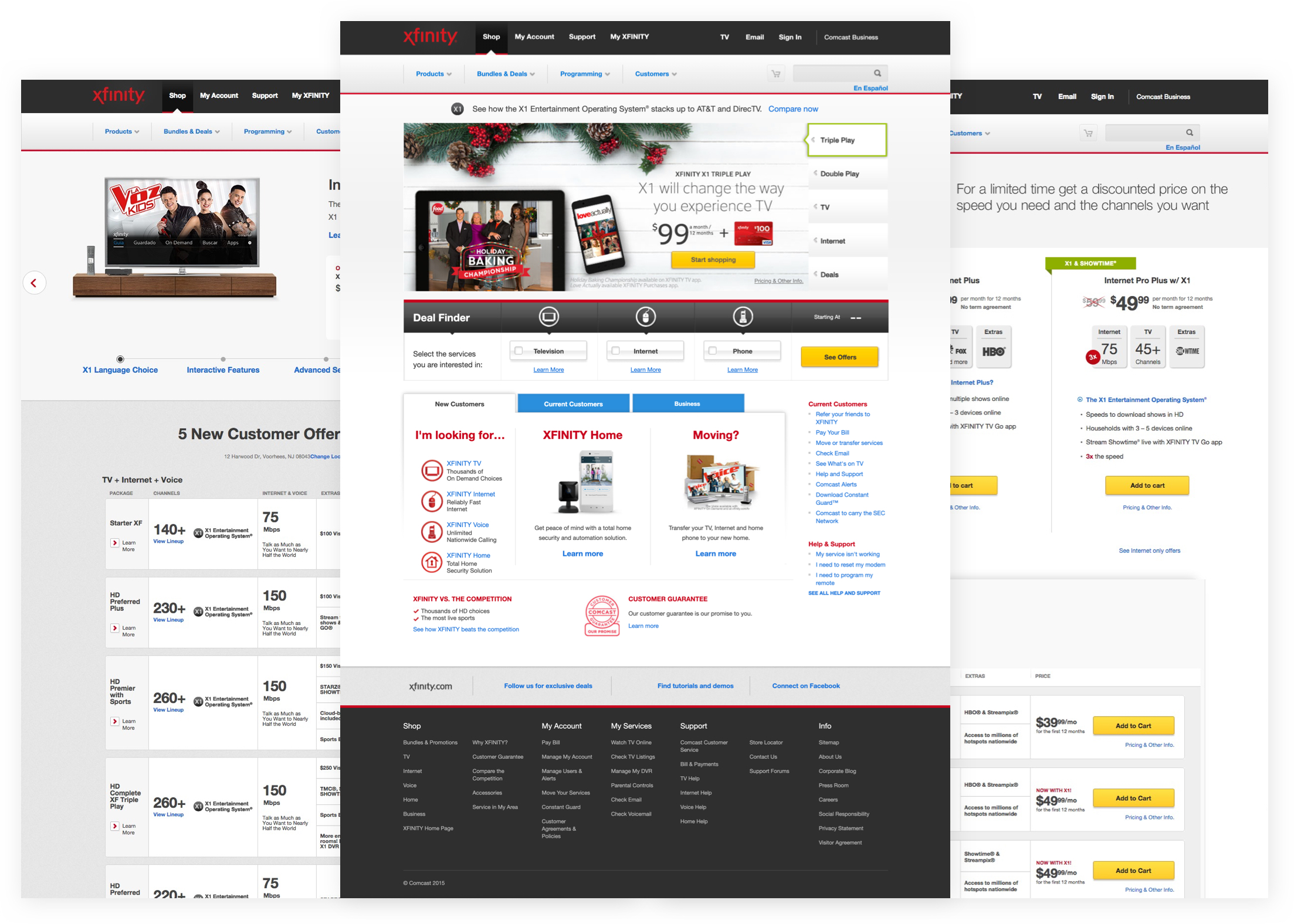
Comcast is the largest internet service provider in the United States, yet in 2015 customers were still mostly purchasing services through call centers. The Xfinity online experience didn’t really represent the brand in a way that resonated with customers because it was very offer driven, without a clear story or value prop. Products and services were not elevated, and customers didn’t really know the value of the services they were getting because it was not apparent.
The Goals
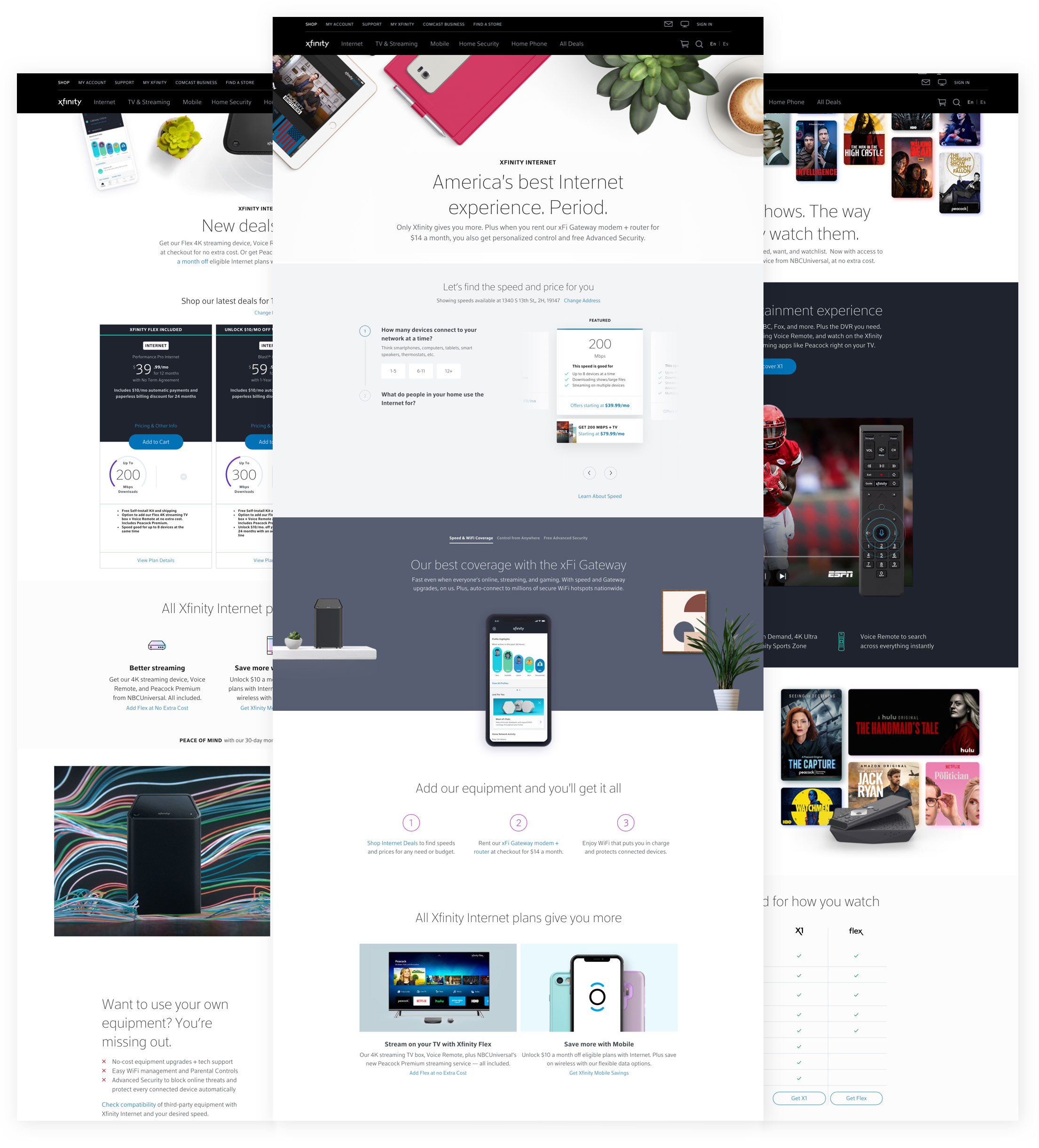
The digital transformation's goal was to redesign the full xfinity.com shopping experience to focus on simplification, transparency, and education, redefine experiences across the customer journey, and transform how Comcast operates in the digital space. We also aimed to elevate our products and services to showcase Xfinity's competitive differentiation.
Emphasize Value
Redefine the Xfinity site structure to promote value over price
Online Purchasing
Digital Purchasing
Digital Purchasing
Shift to digital transactions and reduce calls to sales centers
Shift to digital transactions and reduce calls to sales centers
Shift to digital transactions and reduce calls to sales centers
Shift to digital transactions and reduce calls to sales centers
Shift to digital transactions and reduce calls to sales centers
Product Education
Helpfulness
Elevate the brand, focus on product education and emphasize value
The Design Approach
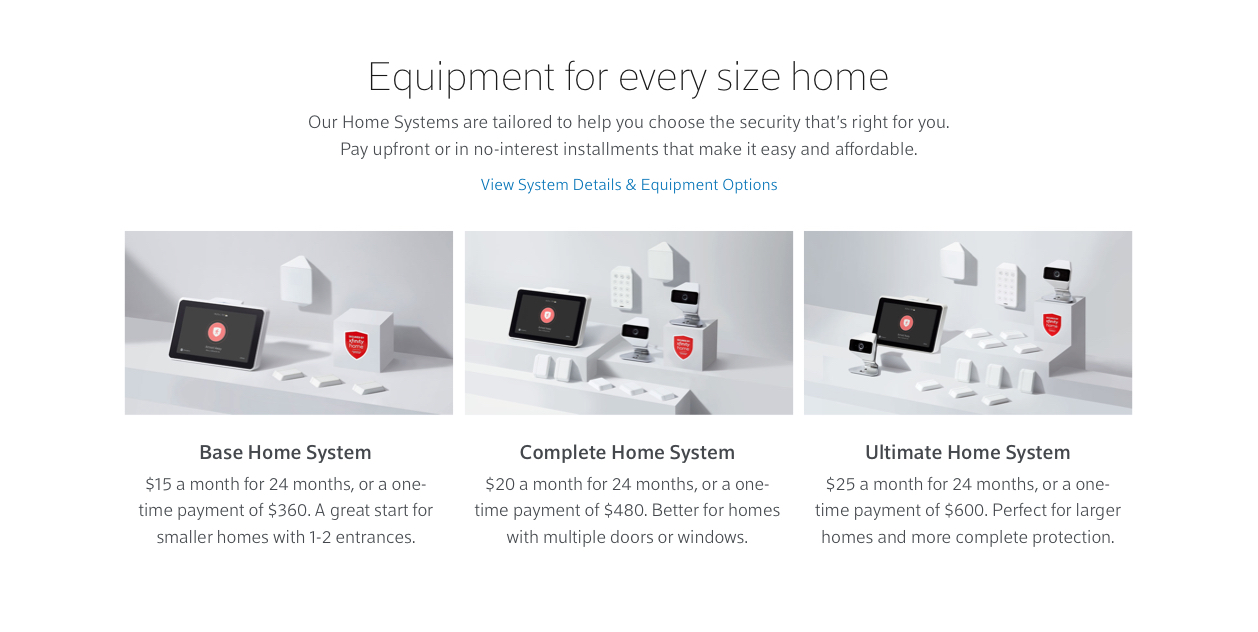
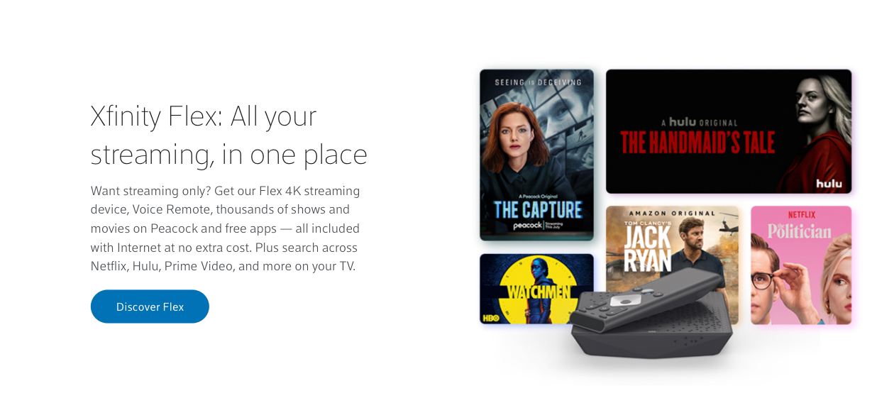
We wanted to design a frictionless and immersive digital experience that empowered customers to learn and shop for Xfinity products online. We also wanted to create a design system that allowed us to rapidly build and update pages through CMS templates and modules.
My team was focused on the learning and shopping experience, the area of the site that our customers go to learn about service before adding something to cart and proceeding to the checkout flow.
The Before
The After
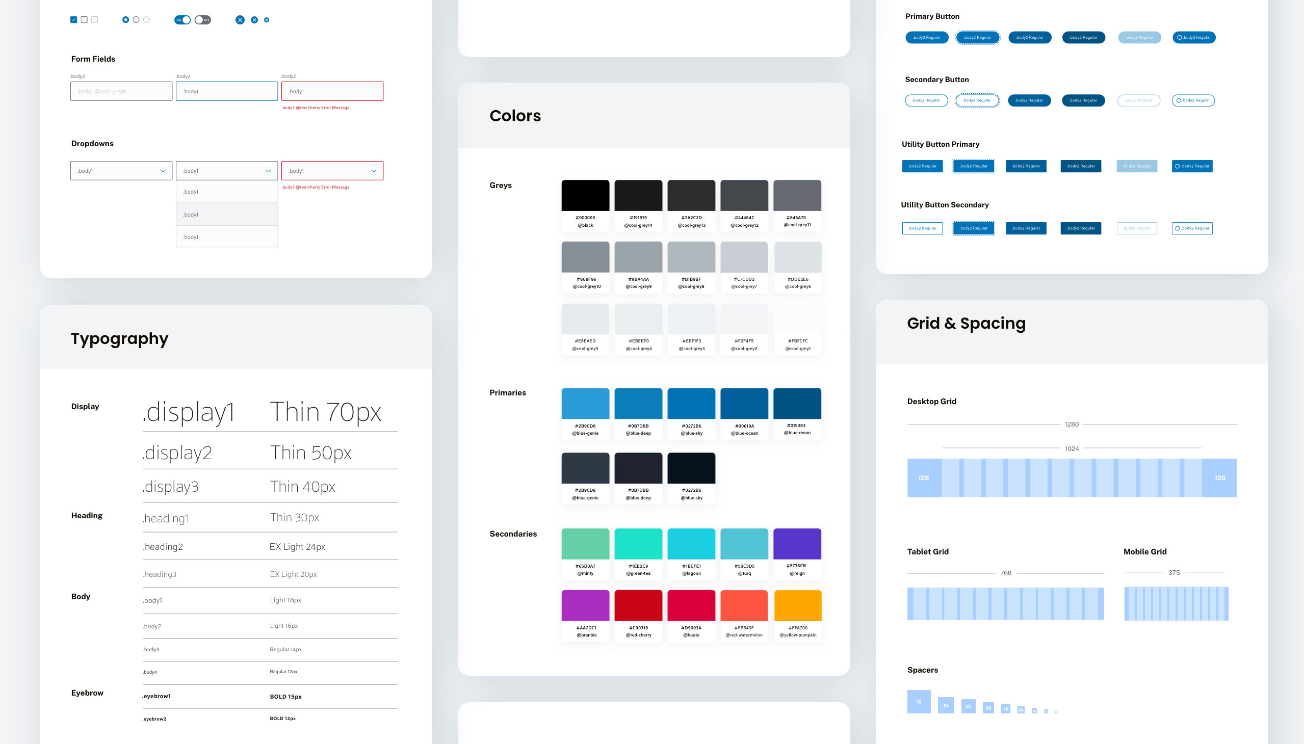
Design Patterns
Design Exploration
Design Exploration
I joined the team midstream of this project and our Creative Director, Design Manager, and Junior Designer had already started working on UI design patterns to use throughout the end-to-end experience. I was able to jump in and hit the ground running designing a lot of the experience pages, as well as the module templates we implemented into our CMS.
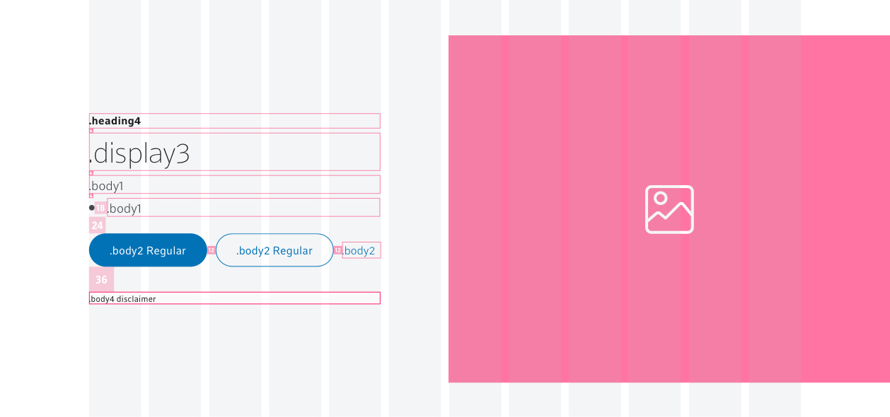
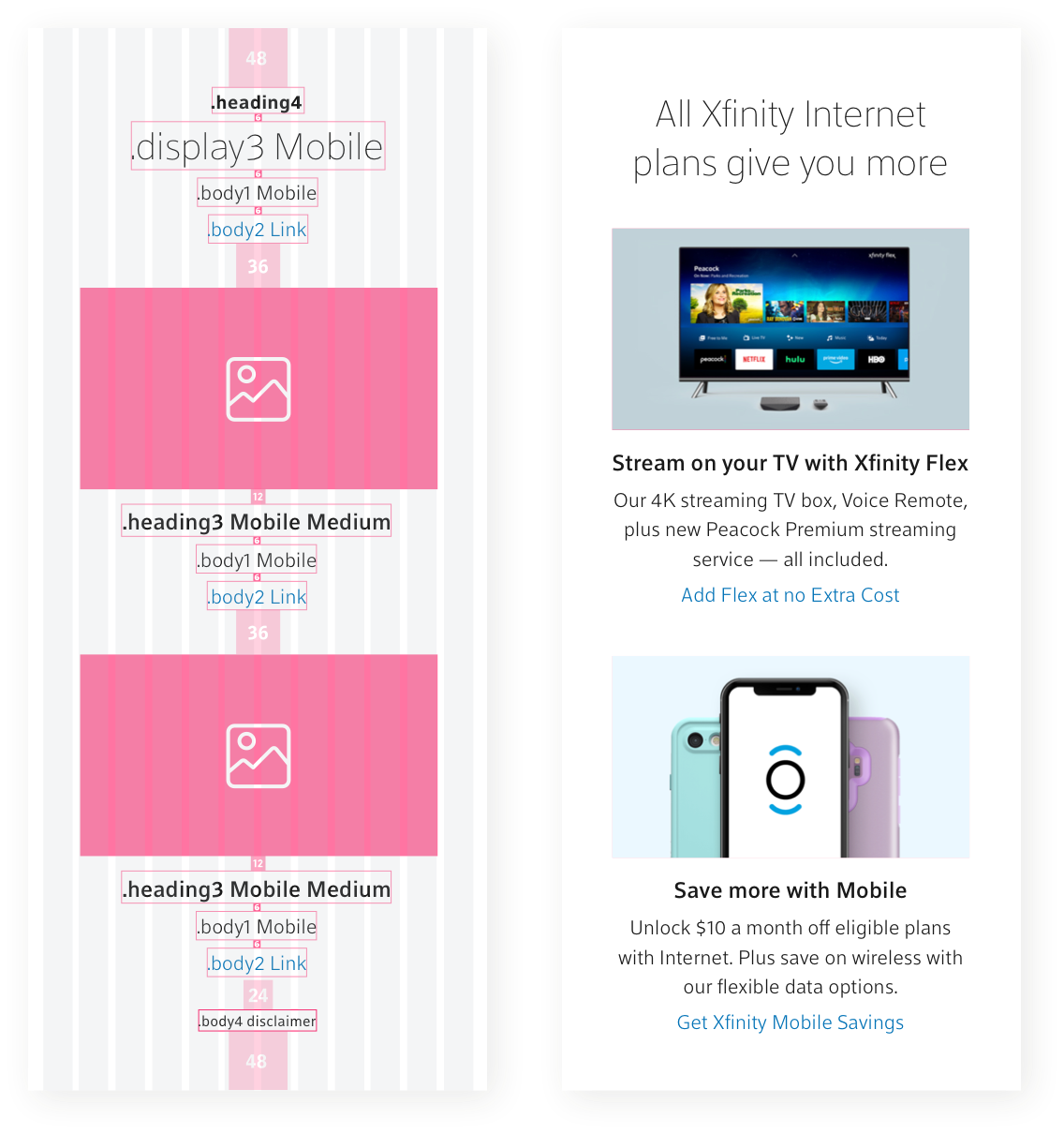
Module Templates & Documentation
Design Exploration
Design Exploration
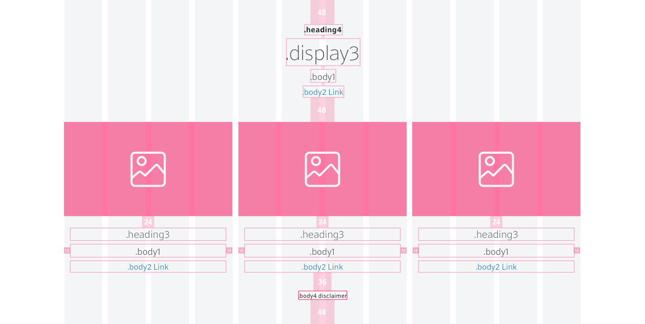
Once we had designed a number of pages for the experience I started creating and documenting a scalable component system, and resource library for rapid page builds through CMS templates and reusable modules.
During this process, I established a close working relationship and open communication with the front and back-end engineers, Product Managers, and content analysts and became embedded in their process as we build these modules and our pattern library.


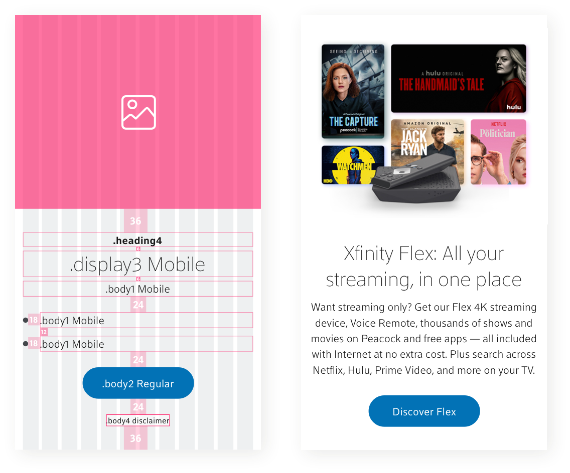
Design System & Pattern Library Implementation Results
Design Exploration
Design Exploration
The utilization of a scalable design system, UI pattern libraries, and CMS templates proved to be incredibly successful by helping us realize faster page load times and less time spent on page builds.
5X
Faster Speed to Market
Faster Speed to Market
+33%
Faster Page Load Average
Faster Page Load Average
Faster Page Load Average
Learnings
Design Exploration
Design Exploration
Once we launched this project and the Campaigns & Merchandising Design team started using the system, they voiced some concerns about the templates' rules being a bit too restrictive. Over the last year, and in collaboration with designers from the Camps & Merch team, we've worked on adding more flexibility to the system.
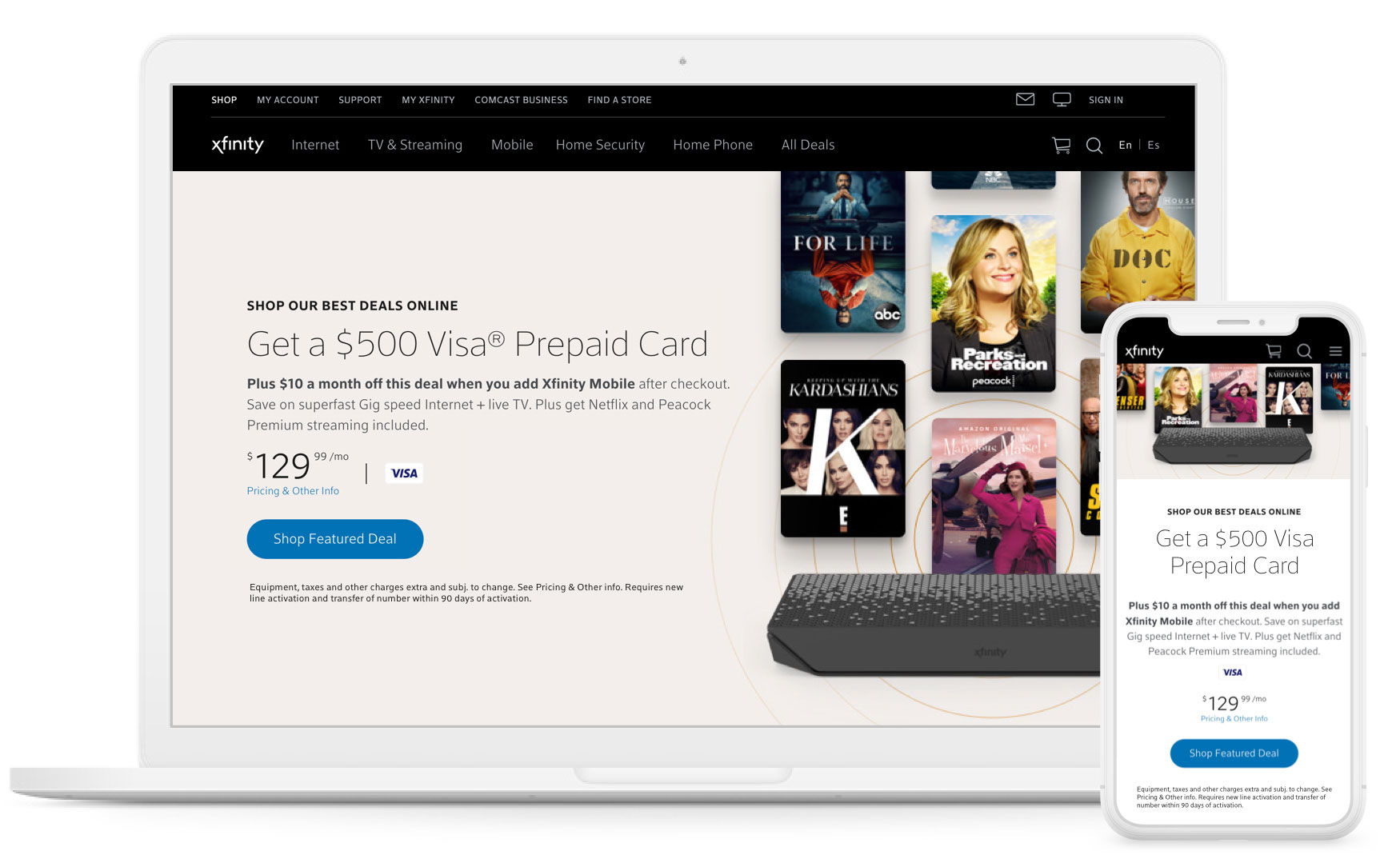
Seeing Results
By the end of 2018, we had successfully launched the redesigned experience on xfinity.com. Customers placed orders at a more efficient rate, resulting in improved business performance under the Digital Transformation initiative.
+28%
Desktop Conversion Rate
Desktop Conversion Rate
Desktop Conversion Rate
+45%
Mobile Conversion Rate
Mobile Conversion Rate
Mobile Conversion Rate
+33%
Add-to-Cart Rate
Add to Cart Rate
Add to Cart Rate
+27%
Checkout Start Rate
Checkout Start Rate
Checkout Start Rate
+11%
Average Order Value
Average Order Value
Average Order Value
Awards
2017 WebAwards Outstanding Achievement- ISP Standard of Excellence:
XFINITY Internet Learn Experience
2017 MarCom Awards Gold- Website Redesign:
XFINITY.com Learn/Shop Experience Redesign
2017 MarCom Awards Gold- Business to Consumer Website:
XFINITY.com Learn/Shop Experience
2017 MarCom Awards Platinum- Mobile Website Product:
XFINITY.com Learn/Shop Mobile Experience